Getting Started
InstallationPro InstallationPROUpgrade to v0.1Guides
Create a Custom Editor PanelComponents
ThemeEditorProviderHyperThemeEditorThemeEditorThemeEditorDrawerThemeEditorDrawerHeaderThemeEditorDrawerFooterThemeEditorRootPanelThemeEditorButtonColorModeToggleThemeIconHooks
useThemeEditorEditors
ColorsFont SizesTypography PROFonts PROLine Heights PROLetter Spacing PROShadows PRORadii PROSpace PROThemeEditorDrawerHeader
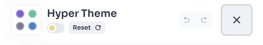
The ThemeEditorDrawerHeader component is the default header component rendered inside the ThemeEditorDrawer.
It provides undo/redo functionalities, the ColorModeToggle, a Reset Theme Button and the Close Drawer Button.
View source
Import
Known Issue!
Importing from
Be sure that you're importing only from
@hypertheme-editor/chakra-ui-core leads to a known issue with recoil.Be sure that you're importing only from
@hypertheme-editor/chakra-ui or @hypertheme-editor-pro/chakra-ui.Community Version
import { ThemeEditorDrawerHeader } from '@hypertheme-editor/chakra-ui'
Pro Version PRO
import { ThemeEditorDrawerHeader } from '@hypertheme-editor-pro/chakra-ui'
Usage
ThemeEditorDrawerHeader works with the headerComponent prop provided by the ThemeEditorDrawer component.
This is a minimal example explaining how to use the component:
Props
| Name | Type | Default | Short Description |
|---|---|---|---|
onClose | () => void | undefined | Callback that closes the ThemeEditorDrawer |
onClose
The onClose prop is called when clicking on the "close drawer" button.
This prop is overrided by the ThemeEditorDrawer component, so you don't have to mind it.
Prev
ThemeEditorDrawer Component
Next
ThemeEditorDrawerFooter Component