Getting Started
InstallationPro InstallationPROUpgrade to v0.1Guides
Create a Custom Editor PanelComponents
ThemeEditorProviderHyperThemeEditorThemeEditorThemeEditorDrawerThemeEditorDrawerHeaderThemeEditorDrawerFooterThemeEditorRootPanelThemeEditorButtonColorModeToggleThemeIconHooks
useThemeEditorEditors
ColorsFont SizesTypography PROFonts PROLine Heights PROLetter Spacing PROShadows PRORadii PROSpace PROThemeEditorDrawerFooter

The ThemeEditorDrawerFooter component is the default footer component rendered inside the ThemeEditorDrawer.
It provides a Close Drawer Button and the Export Theme Menu.
View source
Import
@hypertheme-editor/chakra-ui-core leads to a known issue with recoil.Be sure that you're importing only from
@hypertheme-editor/chakra-ui or @hypertheme-editor-pro/chakra-ui.Community Version
import { ThemeEditorDrawerFooter } from '@hypertheme-editor/chakra-ui'
Pro Version PRO
import { ThemeEditorDrawerFooter } from '@hypertheme-editor-pro/chakra-ui'
Usage
ThemeEditorDrawerFooter works with the footerComponent prop prop provided by the ThemeEditorDrawer component.
This is a minimal example explaining how to use the component:
Props
| Name | Type | Default | Short Description |
|---|---|---|---|
actionButton | ReactNode | ThemeDownloadButton | Component rendered as action button |
onClose | () => void | undefined | Callback that closes the ThemeEditorDrawer |
isMobile | boolean | undefined | boolean that hides the footer if on mobile device |
actionButton
By default the ThemeEditorDrawerFooter renders a ThemeDownloadButton (like in the image below).
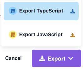
The ThemeDownloadButton acts as a downloader for the theme using the HyperTheme API.
You can override this button putting your custom component, like in the example below:
This prop accepts a ReactElement value.
onClose
The onClose prop is called when clicking on the "close drawer" button.
This prop is overrided by the ThemeEditorDrawer component, so you don't have to mind it.
isMobile
The isMobile prop decides whenever to render the footer or not if on mobile device.
This prop is overrided by the ThemeEditorDrawer component, so you don't have to mind it.
Prev
Next